[fusion_builder_container backgroundcolor=”” backgroundimage=”” backgroundrepeat=”no-repeat” backgroundposition=”left top” backgroundattachment=”scroll” video_webm=”” video_mp4=”” video_ogv=”” video_preview_image=”” overlay_color=”” overlay_opacity=”0.5″ video_mute=”yes” video_loop=”yes” fade=”no” bordersize=”0px” bordercolor=”” borderstyle=”” paddingtop=”20px” paddingbottom=”20px” paddingleft=”0px” paddingright=”0px” menu_anchor=”” equal_height_columns=”no” hundred_percent=”no” class=”” id=””][fusion_builder_row][fusion_builder_column type=”1_1″ background_position=”left top” background_color=”” border_size=”” border_color=”” border_style=”solid” spacing=”yes” background_image=”” background_repeat=”no-repeat” padding=”” margin_top=”0px” margin_bottom=”0px” class=”” id=”” animation_type=”” animation_speed=”0.3″ animation_direction=”left” hide_on_mobile=”no” center_content=”no” min_height=”none”][fusion_text]What is Responsive Web Design
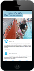
Are you reading this article on a laptop, a PC, an iPad, a Samsung mobile or something else? There are countless types of devices that are used to access the internet and display websites. Responsive Web Design is the technical design and coding to ensure that a single website is accessible, presentable and usable on each and every device.
Why is Responsive Web Design Important
93% of people in the UK own or use a mobile phone and 63% of those use the internet on their phone (Ofcom, 2015).
Given that 93% of people in the UK own or use a mobile phone and 63% of those use the internet on their phone, it is imperative for website’s to work on mobile devices as well as PC’s and laptops.
Mobile phone internet users use their phones to use social media, search for places or services, buy products or services and do online banking. If your business advertises a place / service, advertises through social media or sells a products online – you need your website to work on mobile devices. If your business doesn’t do an of those things, I’d argue it’s not a business!
How is Responsive Web Design Achieved
There are several areas that should be considered carefully, coded accurately and tested thoroughly when designing a responsive website. The three key ones are…
- Sizing and Structure
There are lots of different screen sizes and orientations that need to be considered across the commonly used devices (e.g. Laptop 15″, iPhone 6, iPhone 6 Plus, iPad mini – portrait, Samsung S5, iPad – lanscape).
The trick is to define a limited set of min-max screen sizes that you can then style specifically for devices that fall within that size.
e.g. @media screen and (max-width: 320px) { style code here }
Keeping to a limited set of min-max sizes will keep your code shorter and cleaner which helps a faster loading website.
2. Scaling Content and Images
The font face, font size and content structure should scale to promote easy reading on each respective device. It’s important to test this on devices physically and using web-based testing tools as what looks good and works well on one device may not on an other.
Images need special attention when it comes to website design. Images help users quickly understand the context of the information you are presenting to them. Someone once said “an image speaks a thousand words” – this is true, and it’s important that those words are good words.
An image should be displayable on the device so that it has the desired effect. If an image has a lot of detail and that detail cannot be seen properly within a page on an iPhone then it should be presented differently on an iPhone (i.e. full width of page) and if it still doesn’t have the desired effect then it should not be displayed at all.
3. Navigation and User Experience
The navigation (links and menus) need to be appropriate for each device. The menu used on a PC with a mouse should be different to the menu used on an iPad mini by touch.
When designing a responsive website it’s good practice to list “user scenarios” and walk-through those scenarios as though you were the user on different devices. Mobile menu’s should be big enough to touch and telephone numbers have “click to call” links so that a user can touch the telephone number and then click call (without needing to dial the number).
[/fusion_text][/fusion_builder_column][fusion_builder_column type=”1_1″ background_position=”left top” background_color=”” border_size=”” border_color=”” border_style=”solid” spacing=”yes” background_image=”” background_repeat=”no-repeat” padding=”” margin_top=”0px” margin_bottom=”0px” class=”” id=”” animation_type=”” animation_speed=”0.3″ animation_direction=”left” hide_on_mobile=”no” center_content=”no” min_height=”none”][fusion_tagline_box backgroundcolor=”” shadow=”no” shadowopacity=”0.7″ border=”1px” bordercolor=”” highlightposition=”top” content_alignment=”left” link=”https://nexgenwebdesign.co.uk/contact/” linktarget=”_self” modal=”” button_size=”” button_shape=”” button_type=”” buttoncolor=”” button=”Contact” title=”Contact Us” description=”Want to learn more about responsive web design? Need help configuring your website?
Contact us and ask for some free advice or how we can help you!” animation_type=”0″ animation_direction=”down” animation_speed=”0.1″ class=”” id=””][/fusion_tagline_box][/fusion_builder_column][/fusion_builder_row][/fusion_builder_container]


